
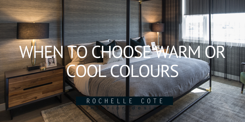
When To Choose Warm or Cool Colours
A month ago we watched the US inaugurate a new President. As one of the most attention grabbing elections in recent history, the eyes of the world were turned to Capitol Hill. Colour spoke volumes on this day. Poet Amanda Gorman was full of sunshine and hope in yellow, Kamala Harris wore vibrant purple, a symbolic nod to a mix of red and blue. The President Elect, big shock here...was in navy blue, the colour of trustworthiness and stability. Carefully selected and speaking volumes without saying a word, colour impacts us very deeply, and the messages sent by these colour choices were felt around the world.
While few of us find ourselves wondering what colour to wear to an inauguration, we often find ourselves choosing colour to live with everyday in our homes.
When we learned our colours in kindergarten it was with a rainbow. Later on we may have seen a colour wheel in high school art class. The wheel, sliced in two, very clearly shows us warm colours one one side and cool colours on the other.
While we may naturally gravitate to certain colours, exploring all colour and what it can do and say is important when we are choosing a colour palette for our homes.
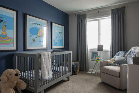
Baby Blue
In the Brookfield Cadenza Showhome, we chose a traditional, trustworthy navy blue for the nursery. Blue, a cold colour, reminds us of water and it’s calming, serenity-invoking properties. Cool colours, because of their longer wavelengths in the light spectrum, tend to “expand” the feel of the space, which can make a small-ish nursery seem larger.
While the cool grey is warmed up here using an ivory undertone, a zen-like sanctuary vibe is achieved in this Brookfield Seton Grandin bedroom with it’s mix of textures and finishes.

We also tend to see cooler colours in our offices and workrooms, as the tranquility evoked fosters focus and concentration, much needed properties when on your third zoom meeting of the day! The connection with water is a natural fit when we are creating a spa feel in a bathroom setting, reminding us of the natural springs and the wellness associated with them. Note the cooling effect of the blue and grey undertones in this white ensuite.


Warmed Up Neutrals with Colour Pops
On the opposite side of the wheel are the warm colours, red, orange, yellow. Fire has been a natural gathering place since we discovered it, so it is no surprise that the social spaces in our homes tend toward warm colours. Gathering in a living room or family room bathed in reds, yellows and oranges we feel cozy, as the wavelengths of the warm tones do the opposite of the cold, they draw the eye in, making the room more intimate.
By choosing neutrals with warm bases and adding to the temperature with fired-up fabrics we create spaces that are warm and inviting. The golden mustard tufted couch and chrome yellow toss cushions bring energy to this jewel box front room...


