Our Favourite Kids Bedrooms
There’s a lot of glamour in designing a sleek kitchen or luxurious dining room, but designing kids rooms is all about fun! We love to really lean into a theme for kids bedrooms and use this as an opportunity to play with a lot of bolder colours and fun patterns. When designing a kids bedroom, you want to make sure to place just as much emphasis on this room as you would on your own master suite. You want the room to reflect what your child enjoys and allow the room to be a sanctuary for them - much as it would be for yourself. There are a few key elements that we love to include in a kids bedroom. Read on to find out what they are!
Graphic Prints to Make a Statement
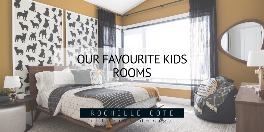
We love using a graphic print in a kids bedroom to really draw the eye to a feature wall and make a statement. Choosing a print that’s more bold and graphic also helps to make the print look more modern and ensures that it will grow with your child for years to come. In the photo on the left, we chose a black and white dog print, but framed it in two large frames to act as a feature behind the bed. Using a black and white colour scheme gives this print a very graphic look and pairs very well with the mustard yellow walls. In the photo on the right, the print is slightly more subtle, but still makes a statement. Done in a monochromatic colour scheme, the print of the wallpaper on this feature wall picks up on the various tones throughout the room and helps to tie it all together.

The Coolest Colours
When designing a room for your kids, keep in mind that they’ll want this to be their sanctuary, and most importantly, their place to sleep! We recommend using soothing, calming colours in a kids bedroom to help create a tranquil atmosphere. In the photo on the left, darker tones of blue and grey make up the stripes on the walls and complement the darker tones of the bedding to give this room a calm, but moody look. By contrast, the photo on the right is done in much lighter tones of blue and grey. The airplane wallpaper and subtle pattern on the bedding add some visual interest without being too overwhelming.

Let Nature Inspire You
Kids are often enthralled with nature and the natural world, so why not use that as inspiration for their bedroom design? There are a lot of fun ways that you can include nature in your designs, but the photo on the left is one of our favourites. This beautiful floral wallpaper adds just the right amount of femininity, but keeps to cooler, understated tones. To complement the wallpaper, we chose a floral print in a similar colour, deeply saturated blue velvet bedding and modern black accents of the daybed and bookshelf to tie it all together. In the photo on the right, the wallpaper is also the star of the show, but in a more subtle way. The jungle print featuring panthers adds an element of playfulness to this room. Add to that a wooden A-frame bed, panther printed pillows and earthy green walls and you’ve got yourself a very cool kids room.

Gallery Walls Are a Great Option
A gallery wall is a great choice for wall decor as it allows you to include themed art in a fun and modern way. You can choose any pieces you want for your gallery wall, but we like to centre them around a theme your child is passionate about in order to make sure that they look cohesive. If it works within your theme, a gallery wall could also be a great place to include art that your child has done themselves! In the photo on the left, we went with a video game theme and used a mixture of text based and graphic prints all done in cooler tones. In the photo on the right, we did a more structured layout of records, but brought in some visual interest by taking some of the records out of their sleeve. Remember to use a professional art hanger when hanging a gallery wall like this to ensure that the spacing is perfect!

More Murals
Murals are another design element that we love to use - especially for kids rooms. It creates such a fun wow moment when kids see it for the first time and allows you to create something completely custom just for them! The photo on the left is a great example of using cooler tones in a very fun, graphic way. Using a variety of grey and blue tones almost makes this mural seem 3D, while picking up on the various shades throughout the room. The photo on the right is definitely a bolder choice, but is still done in a very modern way. It’s a subtle nod to alpine skiing, but is also just a beautiful depiction of the mountains. When in doubt about painting your own mural, you can always call in a professional to ensure that your vision for your child’s room is perfectly executed!

Photo Credit: Shellard Photography

