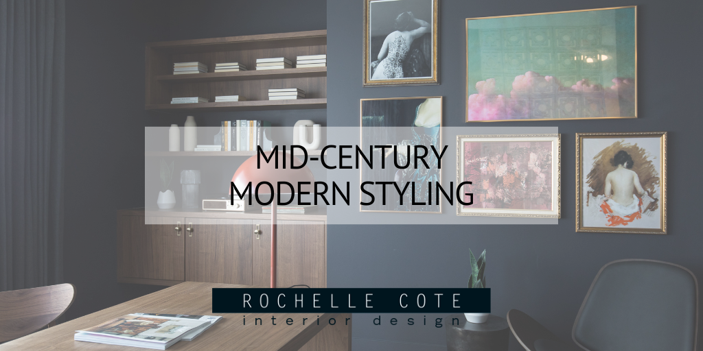
Mid-Century Modern Styling
Since its inception in the 1950’s, mid-century modern design has become timeless. It’s a type of design that we love to infuse into a home, but we like to use it minimally so that a client’s home doesn’t end up looking like the set of Mad Men (as beautiful as the sets were). Below are some examples of our favourite ways to include mid-century modern elements in our designs as seen in one of our most recent projects: The 2023 Hospital Home Lottery Showhome. In this showhome, you’ll see a number of different elements of mid-century modern (MCM) design such as curved shapes, abstract art, outside elements being used inside and brass accents.
Ahead of the Curve
Curved shapes feature prominently in MCM designs and can be seen in everything from lighting to furniture and even art. The curved shapes can add a very calming feeling to the room and often contrast the very angular lines that are also prominent in MCM designs. In the photos below, curved shapes can be seen in both the lighting and the choice of chairs in each of these rooms. The colours of the lighting choices are also reminiscent of the muted harvest gold and rust coloured tones that were often seen in the 50’s and 60’s. Curved lines can also be seen in the beautiful chairs in each room. The curved lines help to move the eye around the space, especially when used in the accent chair as seen in the office on the left. In the photo on the right, you’ll notice 3 pieces of abstract art, which are another staple of MCM design!

Good, Better, Brass
Brass was a very prominent metal in MCM designs and can add a modern and elegant touch to your space. Its yellow-gold tone helps to bring warmth to a room as well as adds a slightly luxurious look. In the photo on the left, this beautiful angular lamp has a long brass rod to supports the shade that adds some drama to the room. You’ll notice the curved lines of the shade itself, as well as a very popular chair designed by Charles and Ray Eames that is possibly one of the most significant designs of the 20th century. The art in this room is also in line with the very abstract, graphic style that can often be found as part of MCM design. In the photo on the right, brass can be seen again in the choice of lighting, as well as in the picture frames. Adding some brass frames to this gallery wall brings some brightness to the composition.

Go Abstract with Art
Abstract, and often graphic art, is a staple of MCM design. It often features either curved or very sharp lines and is usually done in more muted tones. This style of art is especially pleasing for your home because there are a number of different ways to interpret abstract art, so you’ll never get bored of seeing it when you walk by. In the photo on the left, the small print adds a subtle touch of MCM style with its curved shapes and muted palette. You’ll notice that there are a number of brass touches in this kitchen area as well from the candlesticks to the cabinet pulls and even the picture frame itself. In the photo on the left, the art is more graphic and has a lot more movement. Splitting the composition up in this way makes for a much more energetic piece, which can help infuse life into a room. We love to place two pieces of art above a console like this along with vases to create a beautifully styled vignette in a room. As a bonus, the console in this photo boasts a terrazzo pattern, which is often seen in MCM design. The trick with terrazzo is to use it sparingly like we’ve done here.

Bring the Outside In
One of the more unique aspects of MCM design is the prevalence of using exterior materials in the interior of the home. In the photo on the left, the fireplace is done all in a white brick, which you would typically see on the facade of a home. Using bricks in this way feels very out of the ordinary, but can be very eye-catching. By painting the bricks white, this ensures that they still feel modern and allows them to blend seamlessly into the room, while still adding some texture. In the photo on the right, one of the walls of the office is made using cinder blocks in a square and circular pattern (again including those curved lines) to create a very fun, patterned wall. The juxtaposition of the solid, white, cement block wall, with the delicate glass framed in black adds contrast, and a lot of visual interest.

Photographer Credit: Joel Klassen Photography

