How to Style a Kitchen Backsplash
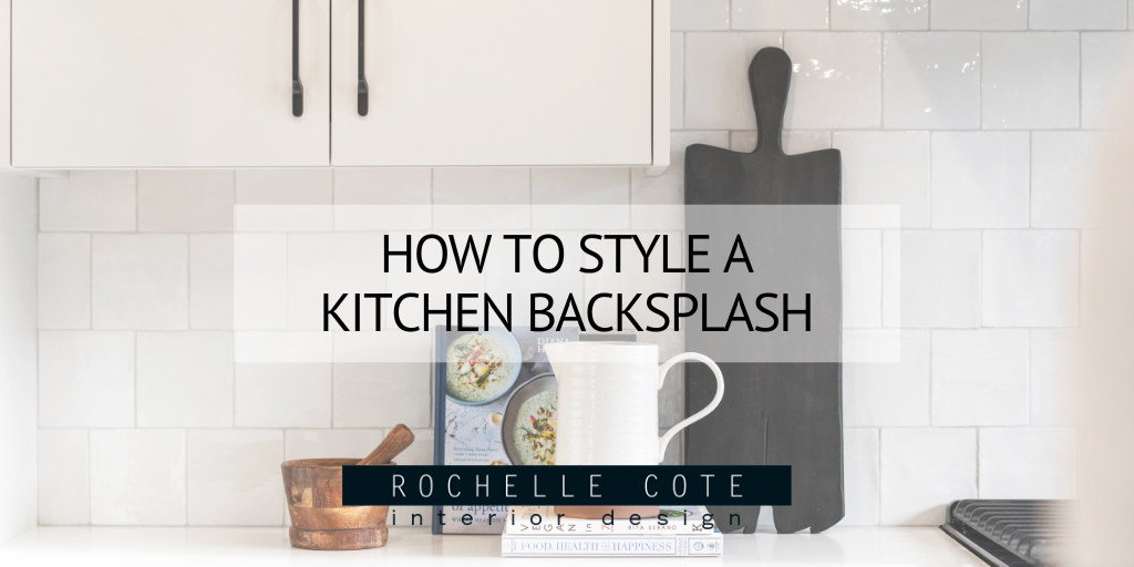
Styling your kitchen backsplash is a delicate balance between things that are useful to you when cooking and beautiful decorative objects. When styling a backsplash, we often reach for cookbooks, vases and bowls, utensils, and wooden objects. We tend to pair these items together to make a functional, beautiful space, often using 2 or 3 of one type of item in a grouping. Each of these items comes in a wide range of styles to suite any space, so make sure to pick items from each of these categories that suite your own home and make you happy. Mixing and matching these different items to combine shapes and textures is also key in successfully styling your kitchen backsplash.
Get Cooking
Cookbooks are a great item to use to style your backsplash. There are so many that are beautifully designed with striking or subtle colours and modern or classic typefaces, so they can add a pop of colour as well as personality to your space. Plus, having them out on your counters means that you’ll actually use them. In the photo on the left, we use a grouping of a few books both standing upright and lying down to create visual interest. The darker books that are standing compliment the deep wood of the cutting board and the stacked white books blend into the white palette of the kitchen to help the vignette still feel light and airy. In the photo on the right, two beautifully designed cookbooks are all that’s needed in this bright space. The grey book that’s peaking out perfectly compliments the grey tray, while the pale pink adds softness.

Beautiful Utensils
Another item that we love to use when styling a kitchen backsplash is utensils. Like cookbooks, utensils have come a long way in terms of design. There are a ton of beautiful options available for utensils from expertly carved wooden pieces to brass to even black coated steel. In the streamlined kitchen on the left, the wooden tones add some warm to the space. They’re conveniently placed next to the stove so that they’re readily accessible when cooking. In the photo on the right, the utensils are a similar wooden tone, but they act as a bright spot in this darker kitchen. In a darker space like this, the tones of the wood help to add warmth and the various pops of wood along the counter help to balance the space visually.

Vases and Vessels
Adding a grouping of vases or vessels to your backsplash is a great way to display special pieces that you’ve found or purchases on recent travels. We love to pair textured pieces that are slightly different in size or shape or grouping three slightly different vases together. If you want to use your vessels to hold fresh flowers or greenery, make sure that they are waterproof first! In the photo on the left, we see a number of textured vases are used on the shelves framing the backsplash. You’ll note that each shelf has pieces that contrast each other in shape, size or colour which helps to balance the shelves. In the photo on the right, we chose subtle white vessels along the backsplash contrasted with a shorter, sculptural black bowl. A cookbook has also been added to this vignette as the sharp corners help to balance out the soft rounded edges of the vases and bowl.

Add Warmth with Wood
One of our favourite ways to style a kitchen backsplash is with wooden accents. They add a wonderful organic quality to the space while adding softness and warmth. The use of natural materials in a space is very calming, so we love using pops of wood when styling a kitchen backsplash. In the photo on the left, we chose to add a number of different shades of wood to this sleek, white kitchen. The monochromatic palette is very calming and the darker shade of the cutting board in front perfectly compliments the deeper tones of the kitchen island. In the photo on the right, there are a number of wooden accent scattered around the backsplash. The wooden bowls in this space double as sculptures with their natural knots, lines and curves. There are a number of pieces on the backsplash around this kitchen, but the key here was to do them all in similar tones of white and wood to keep the space from looking too cluttered.

Photo credit: Shellard Photography

