Why Designers Use Flatlays
Flatlays have become increasingly popular across social media, but one profession that has always used them is interior design. They’re organized and beautiful to look at, but they’re also incredibly helpful to a designer when planning the overall feel of your space. They’re a great tool to use when you want to take a step back and view your entire project as a whole. One way to think of a flatlay is as an interactive mood board. The actual elements of your design are right there in front of you so that you can view how they’ll look as a whole and also feel the textures of the tiles, fabrics and woods that will be included in a design. Below, we’ll jump into why we use flatlays as interior designers, what it actually is, what you might find included in a flatlay and how flatlays can help clients.
What is a Flatlay?
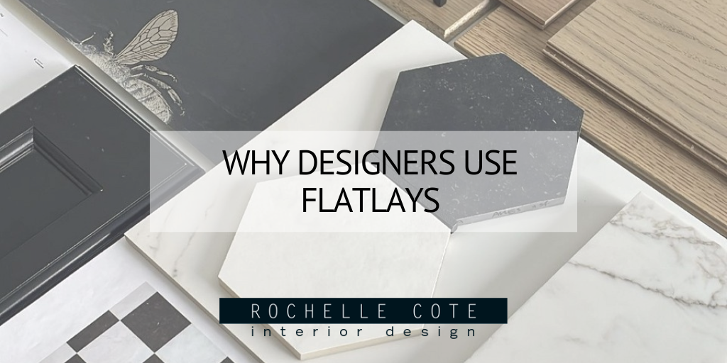
In its simplest terms, a flatlay is a collection of objects placed flat on a surface to be seen or photographed from a birds eye view. For an interior designer, a flatlay is the feeling or mood of an entire project. In order to convey this mood - often for a client - a flatlay incorporates various elements that will be included in the design of the client’s home. A flatlay can be created for a home as a whole or small, individual flatlays can be created for each room should the client wish. In the flatlays below, you can see the different moods that each of these homes will have. While both are fairly neutral, the flatlay on the left has a lot more contrast by playing with black and white tones. Some warmth is added with the flooring and cupboard choices as well as a playful element with the bee wallpaper. In the flatlay on the right, the tones are all very warm and earthy to invoke a sense of calm. There is a lot of texture and a lot of pattern used, but in a very subtle way.

Why Designers Use Flatlays
Oftentimes, clients will try to describe the look and feel that they want their home to have, but their description may not align fully with what they’re visualizing. This is where flatlays come in. They’re an excellent tool for conveying an overall mood or feeling that you want a project to have in a cohesive, visual way. Seeing something visually is often much easier for people to interpret than verbally, so a flatlay is a great way to bridge the gap between the client’s vision and the designer’s interpretation. Designers will use flatlays to show how all the elements of their design will work together in a cohesive way to reflect the needs and wants of their client. It’s also a great tool for showing how different elements will play off one another and to set the overall mood of the design. In both the flatlays below, they have a very natural, organic look and feel to them. They have a balanced mix of texture, pattern and colour that will be used throughout each of these homes.

What’s Included in a Flatlay?
Typically, when a designer creates a flatlay for a client, they will start with a mood or a feeling that they want the overall project to have. To begin laying out a flatlay, a designer will start with the larger elements of the design like tile, flooring and potentially rugs. Layered on top of that are cabinetry, countertops, hardware and smaller accent tiles. Designers will also include fabric swatches to juxtapose the harsher lines of tile and flooring. The swatches are a great textural element to include in your design and can also serve as a place to add pattern. Lastly are paint swatches, wallpapers and finishing touches such as books, greenery or even glassware. As a special touch, it’s a great idea to include personal elements that your client may like or has mentioned in your flatlay. In the flatlay on the left, you’ll see saturated velvet fabrics that add a luxe feel along with some glassware that adds to the overall elevated mood of this flatlay. In the photo on the right, we can see some personal elements that the client would enjoy by including the Christian Dior book as well as the colourful bottle of Confluence gin.

How a Flatlay Can Help Clients
A flatlay is largely beneficial to a client because it allows them to take a step back and evaluate the mood of their home as a whole. It’s a great way to see if everything that a client likes will work together in one home and make sure that all the elements of the design are balanced. They’re also very beneficial because the client can actually interact with the flatlay in a way that they typically couldn’t with a mood board. When viewing a flatlay, a client is able to pick up and feel the weight of marble, the texture of linen swatches, the softness of leather and the ergonomics of a piece of hardware. This will allow them to become better acquainted with the design direction of the home. It’s also a great time to do any editing to further refine any elements that the client wishes to change before starting the project. In the photo on the left, you can see how all the elements of the design work together to create a saturated, yet natural feeling palette with a lot of organic textures. In the photo on the right, the flatlay is full of contrasts. A richly coloured rug and fabrics contrast the starker marble tiles, while modern hardware and sleek tiles contrast the texture and pattern of the accent tile and vase.


